Flat & Black
Built on the two words every Australian says at the counter. A brand you've already said out loud before you've seen the sign.
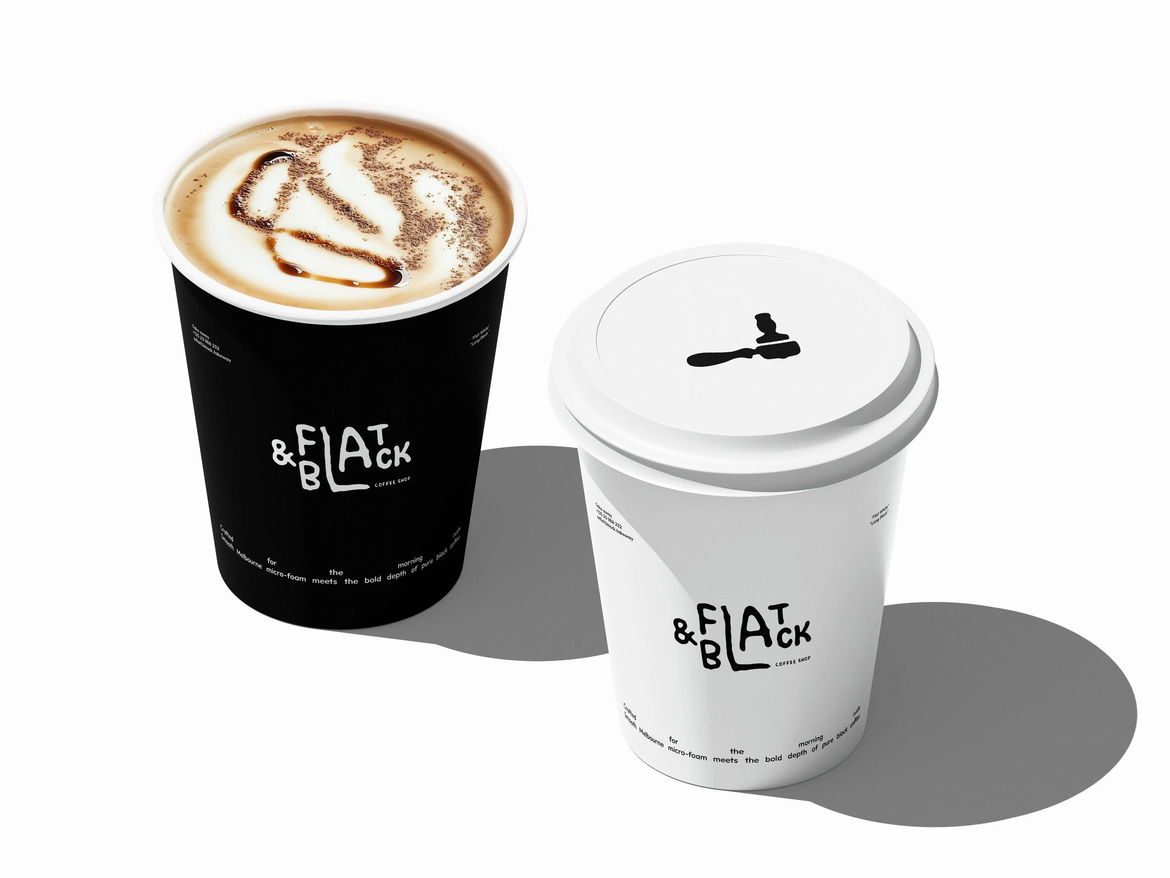
A new coffee shop in Australia isn't entering a market, it's entering a religion. A hundred new shops a year wear the same costume (kraft, a serif, a botanical coffee cherry) and the customer, who has forty seconds and a train to catch, can't tell any of them apart.
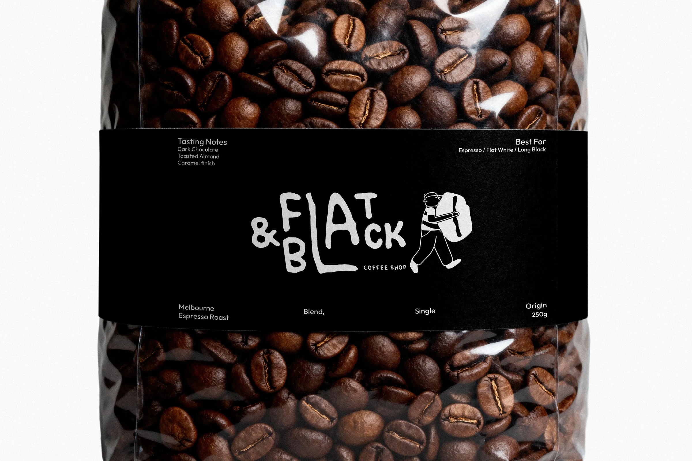
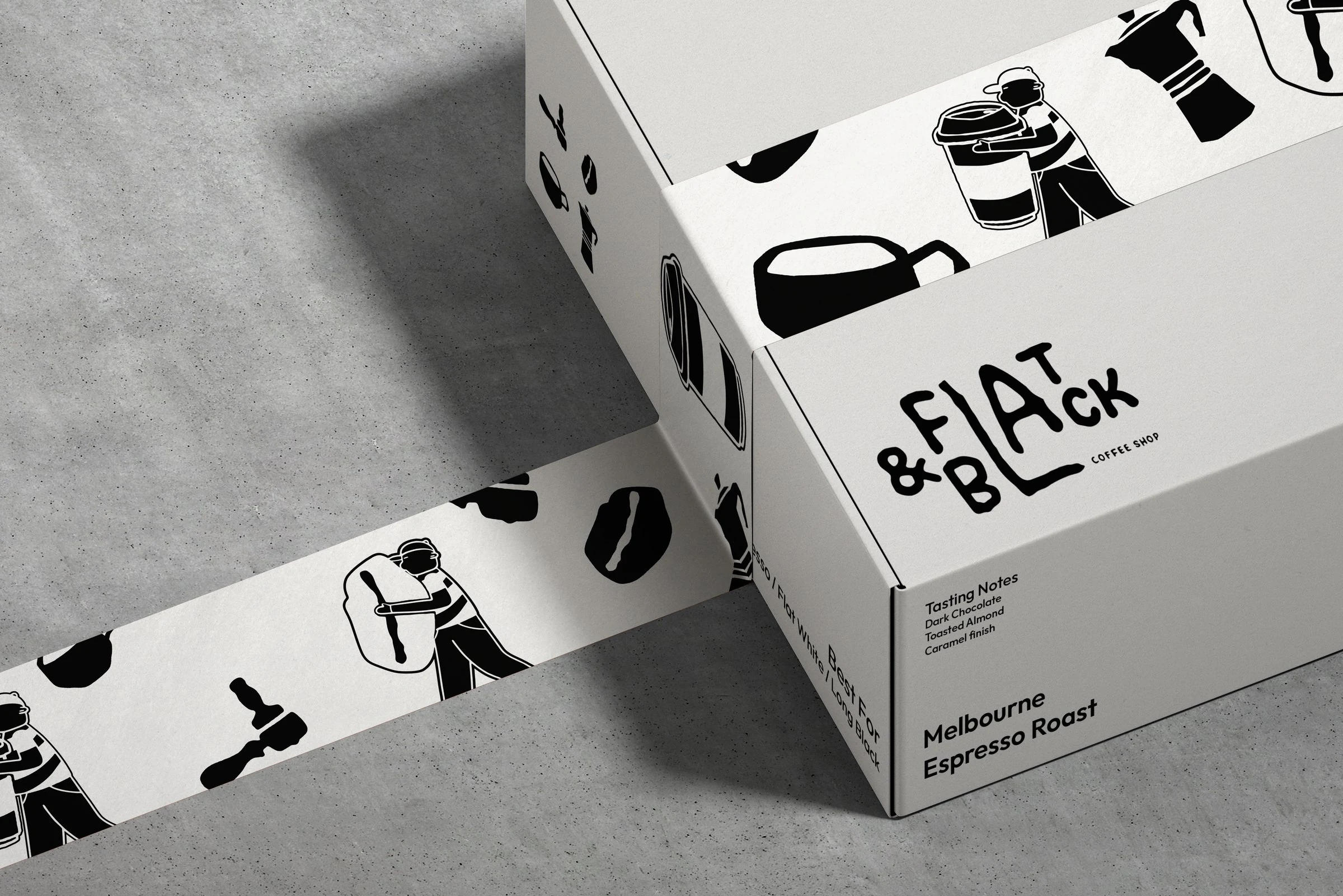
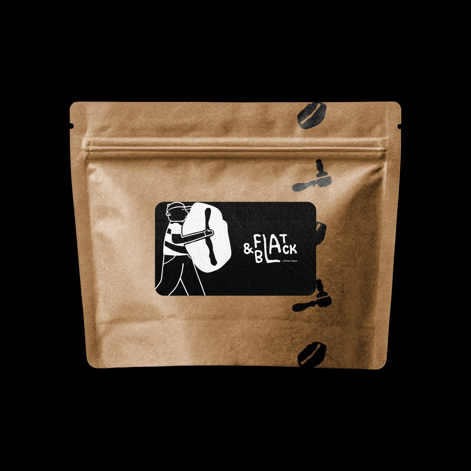
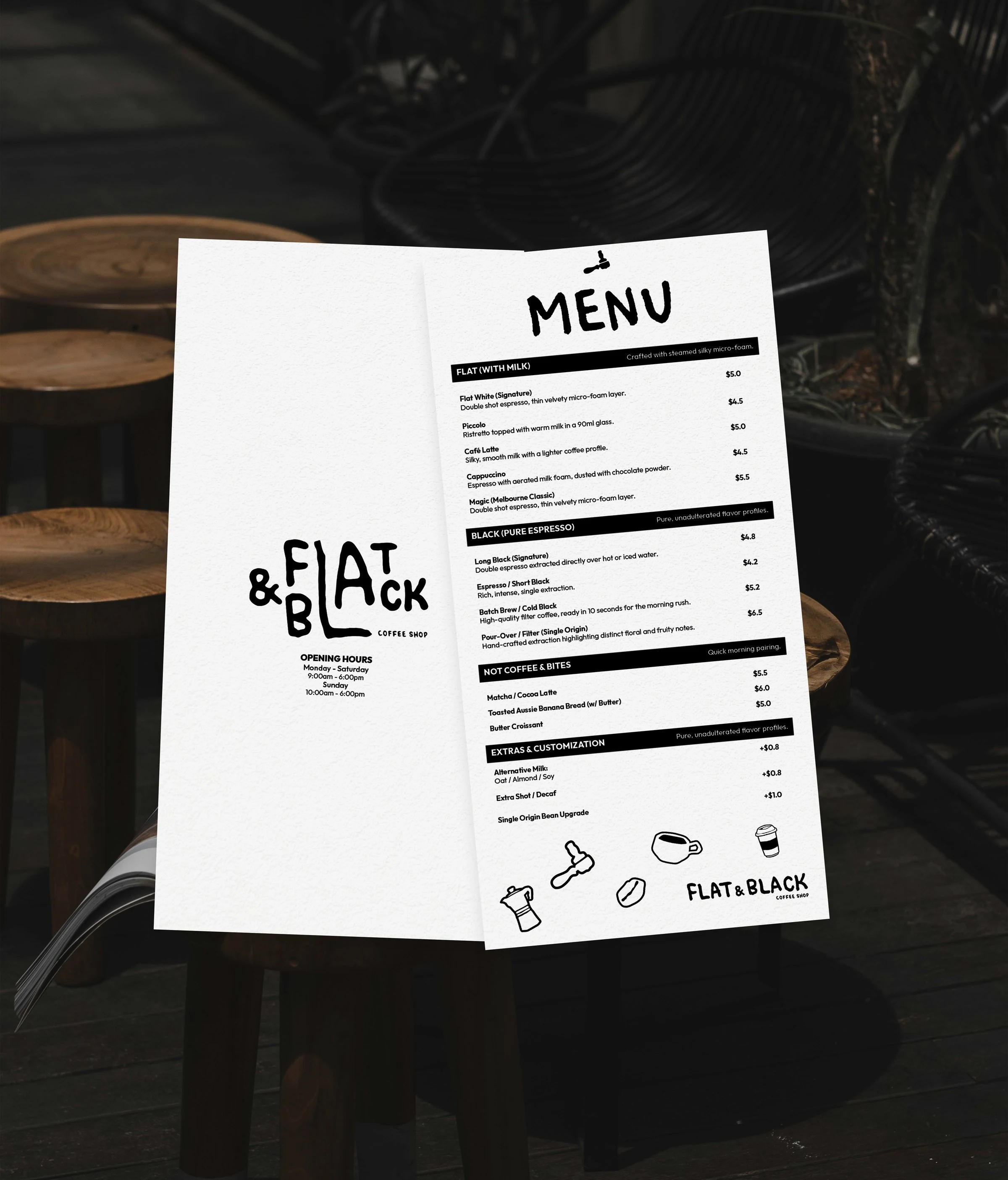
The name is the menu. FLAT on the left, BLACK on the right, milk on one side and no milk on the other, and you stand in the middle and choose. The mark is the bloke carrying the sack, not the bean, because everyone draws the bean.
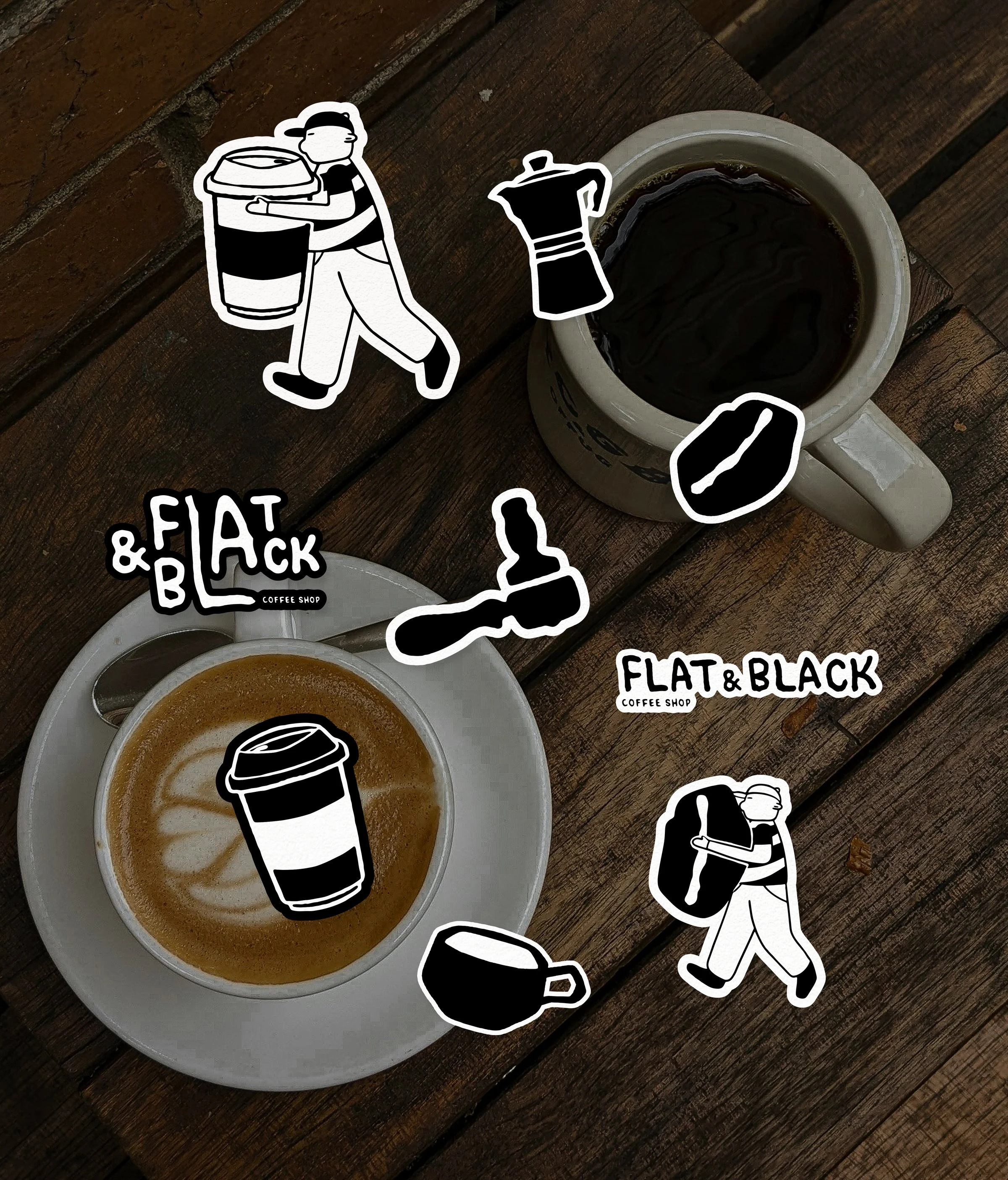
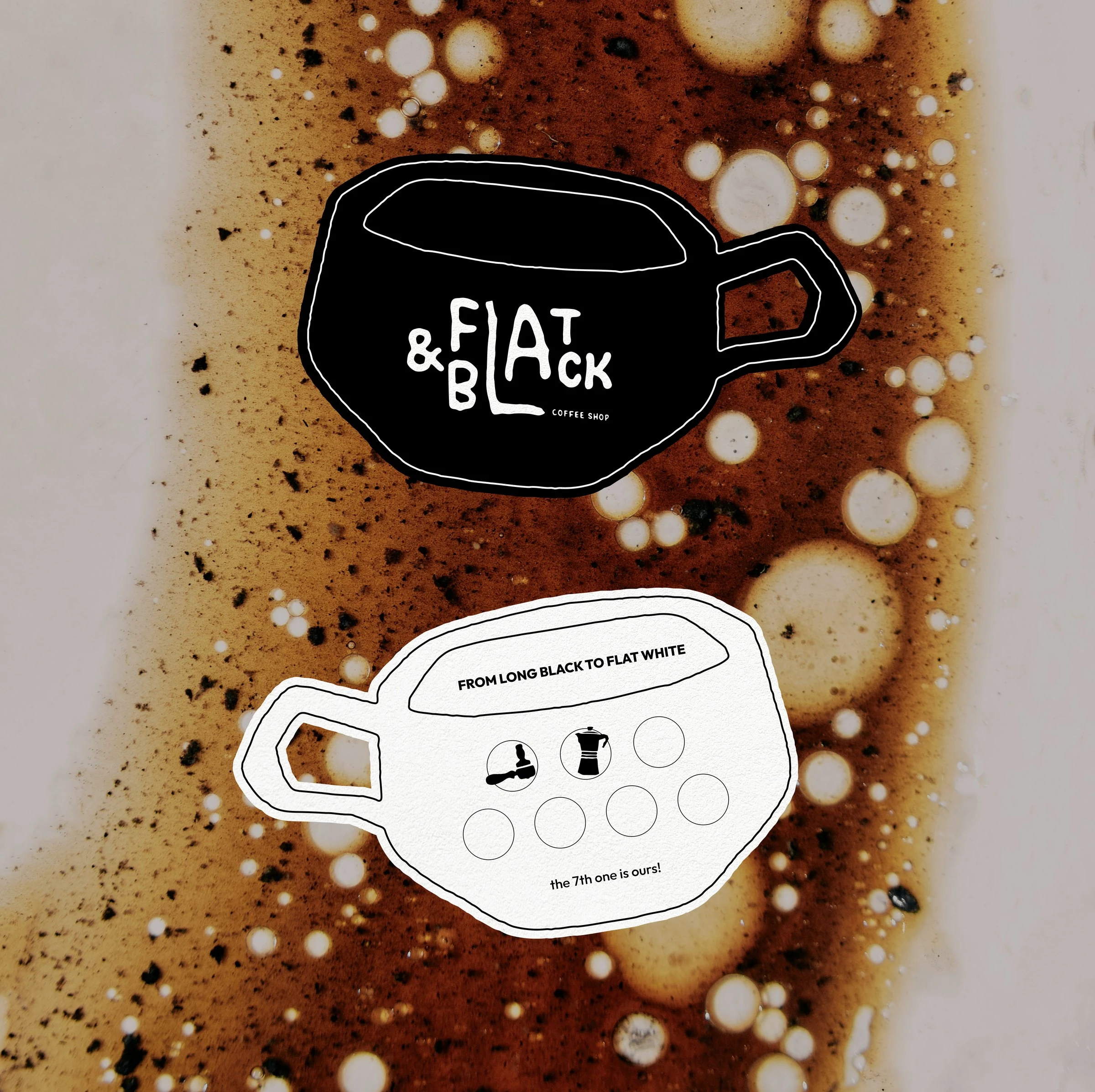
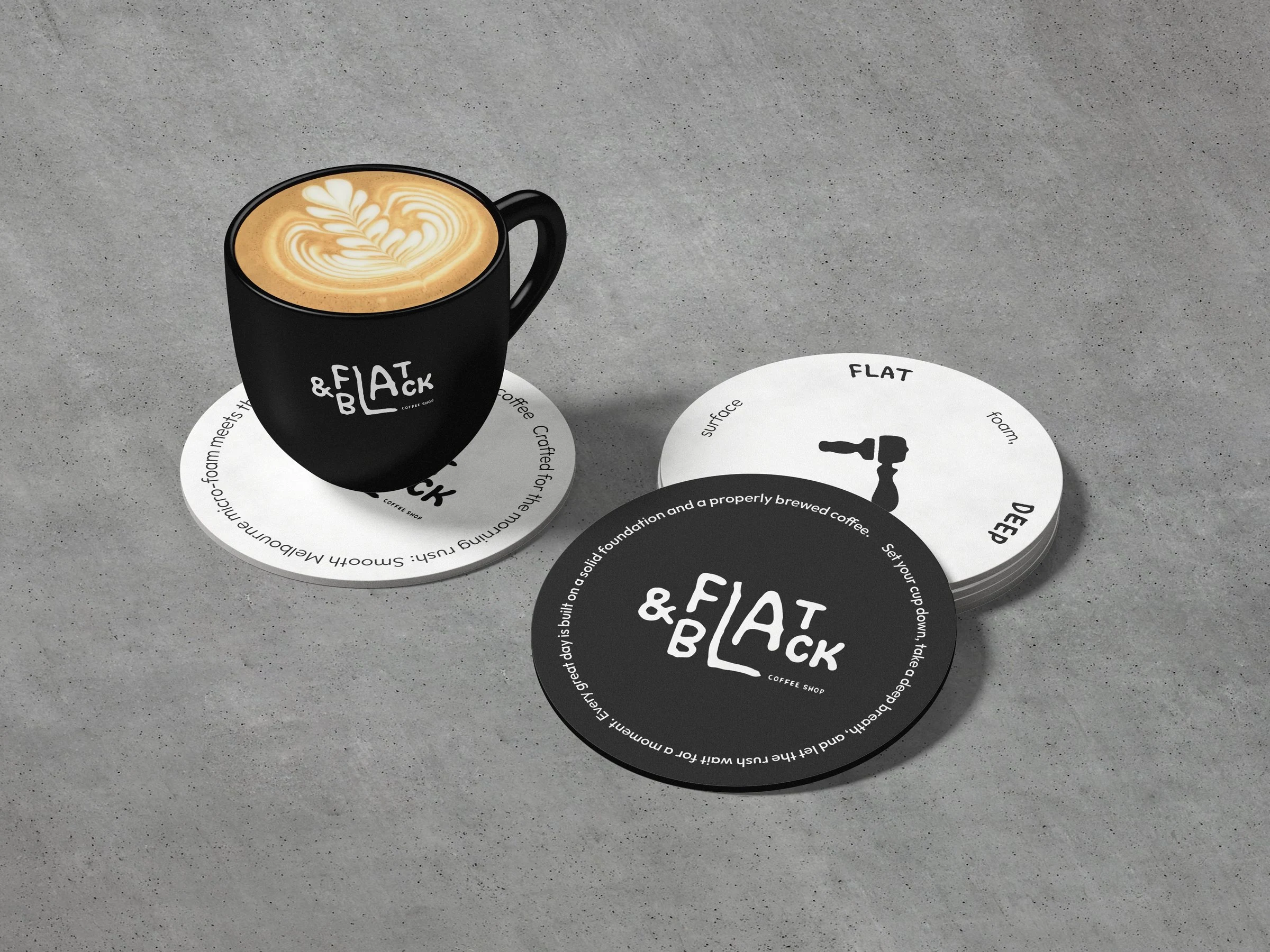
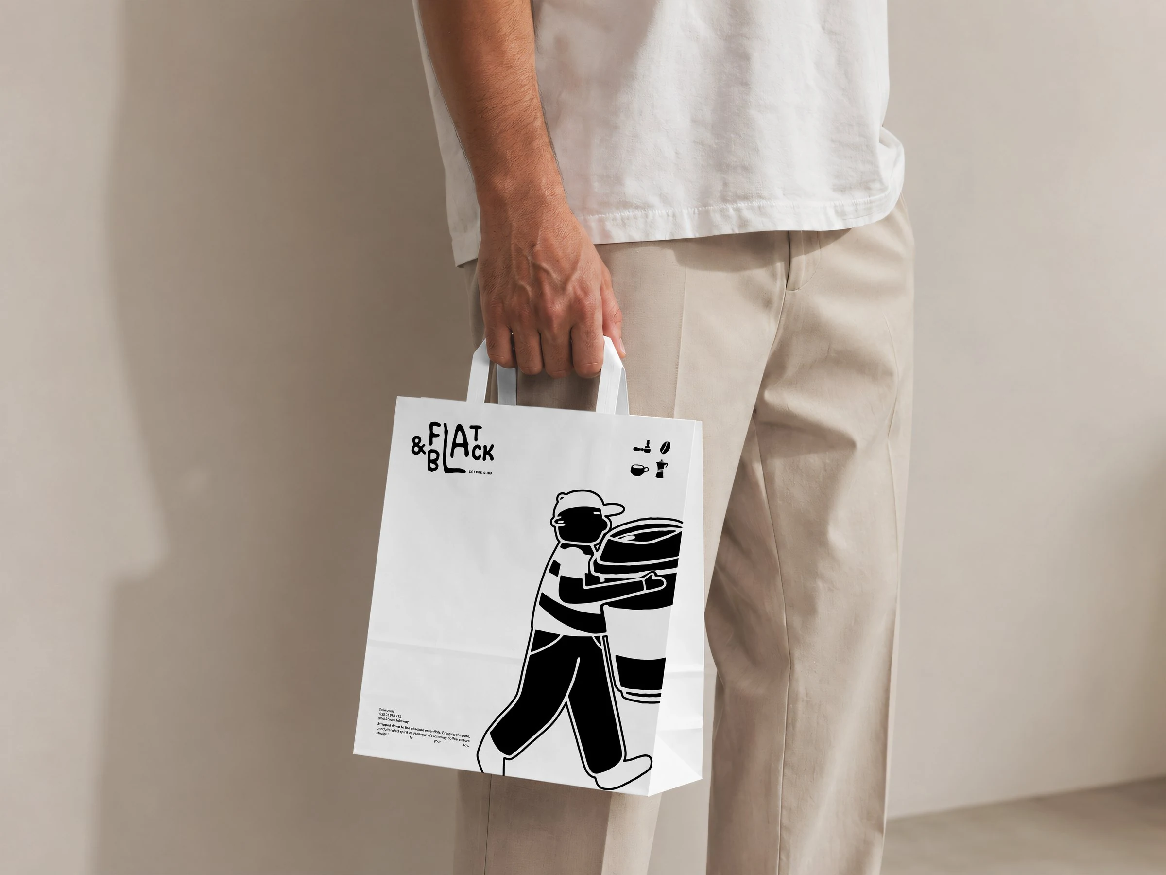
Black and white by argument: the coffee supplies every warm tone the brand will ever need. Hand-lettered wordmark, five pictograms for when there's no room for words, and thirteen pieces that all print in one pass on the cheapest press in town.